Design your data story in 5 steps.
How many times have you struggled with data, text and images trying to put them all together. With templates and AI this has become easier, but as professionals, we still have to communicate our thoughts-whether written,verbal,or visual.
We explore 5 ways in which this can become easier for you. With or without AI.
Most professionals are trained to communicate through language—reports, presentations, and long paragraphs of text. But words have limits. As philosophers and communication theorists argue, language alone is often insufficient to convey thought, insight, or wisdom.

That’s where information design comes in. Designing information means shaping data, text, and visuals into a coherent story that people can not only read but also see, remember, and act on.
Below are five principles that can help you design information that moves from facts to insights, and from noise to wisdom.
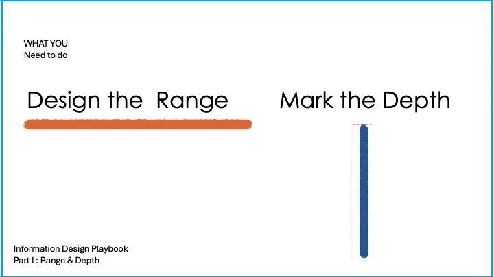
1. Identify your range,mark your depth
Raw facts rarely inspire action. It’s your deductions from the data that will enable your stakeholders to acknowledge your role. Especially when every other software can analyse data and give you the report.
•At the very heart of information design is DEDUCTION. The ability to deduce facts, data, images, visuals into a coherent story. Those are the supporting actors. – This is the depth you wish to go to. Your range is the story you want to tell.
•The goal and objective of the project has to be larger than what your information visually looks.
Imagine if Maslow’s hierarchy of Needs (see image below) didnot have this visual to it. The entire idea is progression of needs which is represented using a steps in a pyramid.
The very first step in an information design project.
Deduction is key. What’s the progression of needs? What’s the range of the story?Think of your central idea. Spend time in deducing your central idea. In Maslow’s model, its not the fact that we have different needs; BUT the fact that needs have a hierachy that’s central to his thought leadership.
In a sustainability presentation I made to a government body, the focus was not just on data, but on the role of stakeholders—policy-makers, brands, and consumers—making the story more actionable. The central idea was that for disruption all stakeholders will have to come together or else we will be at management. I build the whole story around that. My first slide itself was on how the different roles of stakeholders would lead to different future scenarios.
💡 Key takeaway: Start with the central idea, then design the information to support it. (Refer to our storytelling blog to structure your story here: https://www.outofsyllabus.net/newsletter/how-to-tell-a-brand-story)
2. Differentiate Facts from Insights
So how do you communicate your deductions, once you arrive at them?
Charts/Visuals/ Illustrations/ Text
One dimension data is recording, two is reporting.
Putting a third or a context is application. WISDOM A one-dimensional chart is generally best for just raw data. A simple bar chart. ( Sales in different regions, sales across regions, or even over a time period.). A two-dimensional chart enable better understanding of any topic- sales of 2 different products over the same regions,time period and plot your conclusions, plotting the trend in GDP per capita YOY in different countries.
Avoid the mistake of presenting data and then highlighting the obvious. Instead, highlight the insight the data leads to.
Like for example, How Hans Rosling does. (Image 2.2)The goal of this project is to conclude that the population will be full of elderly parents – 2 Dimensional data has already been analysed to bring attention to the fact that elderly parents are a big part of the demographic

I
Image 2.1- This demonstrates the report stage. One dimensional data: Simple Bar & pie chart just presents the data.
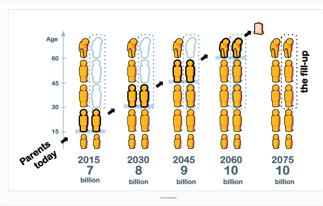
Image 2.2
Analyst’s tool for POV.- Your tool to drive your point/action.
2 Dimensional data has already been analysed to bring attention to the fact that elderly parents are a big part of the demographic
3. Start With the Intended Outcome
Information design is not decoration—it’s decision-making support. Before you choose do this process:
Outline the TASKS:
What does the data look like, and what are its important aspects? Where did it come from, and why was it originally collected?- CONTEXT
What needs to happen with the data? What are the low-level questions and tasks that will support high-level goals?
This is the most important one - What data needs to be used only for analysis – Need not be reported.
Outline the Stakeholders
Who is involved with the data, the problem, and the goals? What can they say about the problem to help design an effective visualization?
Who will view the final visualization, and what sorts of things do we expect them to learn from it? What domain knowledge do they bring to the table? What answers would they find satisfying?
4. Format Follows Thought
Professionals often assume the format (report, slide deck, video) dictates the length and structure. In reality, the idea should decide the format.
Do we only need visualization for quantitative data? Outline the Visualization How does the understanding of data, tasks, and stakeholders come together? What representations of this data will fulfill the tasks for the users?
Rather it is whether through the use of the graph we can see something that would have been harder to see otherwise or that could not have been seen at all
Does every project need to be visualized?
A one-hour talk doesn’t always need an hour of content.
A 100-page report doesn’t need 100 pages of filler.
Choose the format that best fits your story and thought.
💡 Key takeaway: Don’t stretch ideas to fit a format. Fit the format to the idea.
5. Balance the Elements
Not every piece of information needs to be visualized. Balance is key:
Numbers can overwhelm. Ask: should they be shown as values, visuals, or comparisons?
Data-Ink ratio: Use only as much text, charting, or color as needed to support clarity.
Symbols aid memory—design with recall in mind, not just comprehension in the moment.
💡 Key takeaway: Design for clarity, memory, and ease of exploration—not decoration.
Cheat code- From Noise to Wisdom: try removing some text or visual and observe if the story still makes sense/is coherent.

Noise to Wisdom
Every piece of information you design travels a journey:
Data → Recording → Reporting → Insight → Wisdom
Or more simply: Noise → Signal → Action
For professionals, the ultimate goal is not just to present data but to enable better decisions, stronger buy-in, and lasting impact.
Professional checklist before your next report/presentation:
What’s the main story I’m telling?
What outcome am I driving toward?
Am I showing insights, not just facts?
Does the format support the thought, or the other way around?
Will the audience remember this tomorrow
Designing information is not about making data look attractive. It’s about ensuring that thoughts are communicated, insights are clear, and wisdom is accessible. For professionals in management, policy, consulting, or research, mastering these principles is the difference between information that gets ignored and information that drives action.